The Role of Website Design in Increasing Conversions
In the digital landscape of cleaning services, the design and functionality of your website play a crucial role in engaging visitors and converting them into customers. While many focus on visual elements like images and colors, effective typography is a fundamental aspect that can dramatically impact user experience and brand perception. This post will go into how thoughtful typography choices can enhance readability, guide visitors through your content, and ultimately boost your conversion rates.
For more insights on improving your cleaning business’s online presence, visit our homepage.
The Role of Website Design in Increasing Conversions
The design of your cleaning service website is more than just an aesthetic choice; it’s a strategic tool that can significantly impact your conversion rates.
However, among these elements, typography often plays an underestimated role. Typography does more than just present text—it shapes the way your content is perceived and absorbed. The right typography can enhance readability, establish a clear visual hierarchy, and subtly guide users through your site, making it easier for them to engage with your content and take desired actions.
For example, Tailoring Website Content to Audience Reading Levels explores how readability can be improved by thoughtful font choices, ultimately leading to better user experiences and higher conversions.
Evaluate Your Website’s Typography: Scorecard
Ready to boost your website’s effectiveness? Use this scorecard to see how well your font choices align with your brand and enhance readability. Score each criterion below to discover how your website stacks up!
| Criteria | Score (1-5) |
|---|---|
| Professionalism Does the font convey a professional and trustworthy image? |
|
| Readability Is the font easy to read across different devices and screen sizes? |
|
| Brand Alignment Does the font align with the overall brand identity of the cleaning business? |
|
| Consistency Is the font used consistently across the website? |
Your Final Score
Total Score:
16-20: Excellent! Your typography is on point.
11-15: Good, but consider refining certain aspects.
6-10: Needs improvement. Revisit your font choices.
1-5: Critical. Major changes needed to improve your site’s typography.
Why Typography Matters for Conversions
Typography is a crucial yet often overlooked element in web design that directly impacts user perception and behavior. The right typography can convey professionalism, establish trust, and guide users through content seamlessly. When typography aligns with your brand and enhances readability, it encourages users to engage with your site, increasing the likelihood of conversion.
For further insights on optimizing your website for better performance, check out the Cleaning Service Website Optimization Guide: Fast vs. Slow.
Choosing the Right Fonts for Your Cleaning Website
Selecting the right font is essential for aligning your website with your brand identity. Sans-serif fonts like Arial or Helvetica convey modernity and cleanliness, perfect for a professional cleaning service. Serif fonts, such as Times New Roman, can add a touch of sophistication. The key is to choose a font that reflects your brand values and is easy to read across different devices. Consistent use of the chosen font across your website helps reinforce brand recognition and trust.
Optimizing Font Size and Hierarchy for Better Readability
Font size and hierarchy play a vital role in making your website content accessible and easy to navigate. Larger fonts for headings help users quickly identify key sections, while a comfortable font size for body text ensures readability. A well-structured hierarchy guides users through the content, making it easier for them to digest information and take action. By balancing font sizes and creating a clear visual hierarchy, you enhance the overall user experience and improve the chances of conversion.
Using Line Height and Spacing to Enhance User Experience
Proper line height and spacing are critical for maintaining readability and a clean visual appearance. Sufficient line height prevents text from looking cramped, while appropriate spacing between letters and words ensures a smooth reading experience. These elements work together to make your content more inviting and less likely to cause reader fatigue. Optimizing line height and spacing not only improves readability but also contributes to a more polished and professional website that keeps users engaged.
Our blog how to design the perfect cleaning website goes over all the best practices of building a website.
Typography Color and Contrast Scorecard
Use this scorecard to assess whether your text colors and contrasts are optimized for drawing attention to important elements like calls-to-action (CTAs) and ensuring overall readability.
| Criteria | Score (1-5) |
|---|---|
| Text-Background Contrast Is there sufficient contrast to ensure text readability and visual appeal? |
|
| CTA Visibility Do the color contrasts effectively highlight your CTAs, making them stand out? |
|
| Brand Color Integration Are brand colors used effectively without compromising readability? |
|
| Accessibility Compliance Does the typography meet accessibility standards (e.g., WCAG) for color contrast? |
Your Final Score
Total Score:
16-20: Excellent! Your color and contrast choices are well-optimized.
11-15: Good, but there’s room for improvement.
6-10: Needs work. Consider adjusting your color contrasts.
1-5: Critical. Significant changes are needed to improve readability and visual appeal.
Leveraging Color and Contrast in Typography for Visual Appeal
The right color contrasts between text and background are essential for creating a visually appealing and effective website. High contrast helps your content stand out, making it easier for visitors to read and navigate your site. This is particularly important for calls-to-action (CTAs) and other critical elements that drive user engagement.
By using contrasting colors, you can draw attention to CTAs, encouraging users to take action. Effective color contrast also enhances the overall user experience, making your website more accessible and visually engaging.
See CTA’s examples that can have a big impact on conversions.
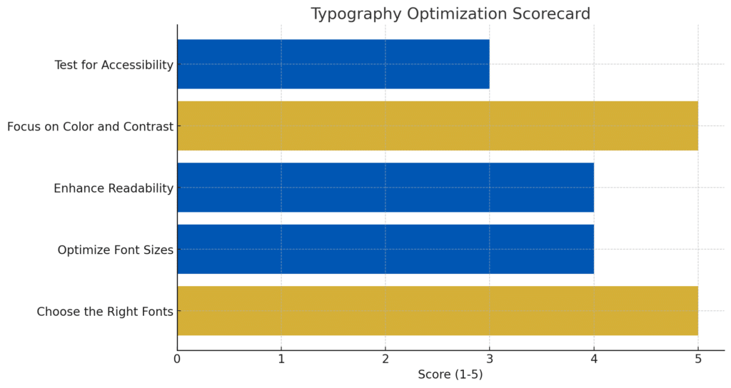
Actionable Tips to Get Started with Typography on Your Website
Ready to enhance your website’s typography? Here’s a quick checklist to get you started:
Choose the Right Fonts:
- Select fonts that align with your brand identity (e.g., modern sans-serifs for a clean, professional look).
- Ensure your chosen fonts are easy to read across all devices.
Optimize Font Sizes:
- Use a clear hierarchy: Larger fonts for headers, medium for subheadings, and a comfortable size for body text.
- Test readability on both desktop and mobile devices.
Enhance Readability:
- Adjust line height (leading) to prevent text from feeling cramped.
- Use sufficient spacing between letters (tracking) and words for a smooth reading experience.
Focus on Color and Contrast:
- Ensure strong contrast between text and background for maximum readability.
- Highlight important elements like CTAs with bold colors that stand out.
Test for Accessibility:
- Check your typography against accessibility standards (e.g., WCAG) to ensure inclusivity.
By following these steps, you can create a visually appealing, user-friendly website that enhances the overall user experience and boosts conversions.
Optimizing typography on your cleaning service website can significantly enhance readability, guide users through your content, and improve conversion rates. By focusing on the right fonts, font sizes, color contrasts, and ensuring accessibility, you can create a visually appealing and user-friendly website that effectively communicates your brand’s professionalism and reliability.
If you need further assistance in improving your website’s typography or overall design, Contact Us today to discuss how we can help you boost your online presence and conversions.
Get the full blueprint in our complete cleaning website design post.